


Cinematography looks in color grading: Where and when?
![]()
In this gallery, Luis Ochoa, director of image post-production at Drago (Secuoya Group), addresses the application of creative looks in color grading, whether defined in the pre-production phase or worked directly in theaters based on a malleable photograph.
There is a subject of photography direction that is particularly interesting to me today: the preview or not of the final look of grading during the filming and the subsequent editing processes, VFX creation, etc.
I will start from the beginning: I have always said that the fundamental work of calibrations (color correction, colorization or whatever we want to call it) is that of match technique or apparently the differences in photographs that the filmed footage may have. No matter how good the director of photography is, there will always be photographic differences between the different shots resulting from filming in non-chronological order, climatic differences, the mix of cameras, etc. The mission of grading will be to make the viewer does not notice those differences manipulating the images until they are very similar or at least so that the jumps are not noticeable, so that for the viewer it is a continuous photographic discourse.
But of course, the moment we have an image manipulation tool it's too tempting not to use it for creative purposes, so that little by little aesthetics or looks have been developed that depend on these grading processes in post-production, and evidently since the birth of the DI or digital grading These possibilities multiplied. That is to say, there are beginning to be productions in which the treatment creative photography is completed in calibrations and the film recorded and the one exhibited would be two different ones.
Creativity in digital grading
some of these looks have been mostly extremes (which does not mean ugly) such as the famous black and white plus color sequences of Schindler's List o Pleasantville or some of the exaggerated looks of Traffic o Blade Runner 2049 (everyone knows that Mexico is bright yellow).
In the present, los color program manufacturers They no longer only develop tools simple manipulation image agnostic of use, leaving it up to each colorist to use them for one purpose or another, but they also propose other tools con specific look creation settings.
But it is true that in parallel, and increasingly, they have been developing looks own post-production a lot more subtle, but still clearly visible: altering the contrast slightly in midtones, gently changing some color vectors for others, adding different dominants in shadows and highlights... In this way, although the changes between shooting and post-production are not radical, cinematographers know that the look requires the final grading processes to be completed.
Nowadays, color program manufacturers no longer only develop simple image manipulation tools. agnostic of use, leaving it up to each colorist to use them for one purpose or another, but they also propose other tools with specific look creation settings, so that, for example, only the saturation and contrast of the midtones for skins are altered, or only some color vectors are modified for color palette control, etc. Recent examples would be the Film Look of DaVinci Resolve or the extremely sophisticated Chromogen from Baselight.
So currently in many fiction productions the final contrast and skin color changes in grading with respect to filming; The colors of the furniture and clothes change, and color dominants appear that were not there before, for example. That is, the art director puts a color on the furniture that is not the one that appears on the screen or makeup sees how dark circles under the eyes are accentuated in the actors that could have been softened on set by having seen this change in contrast, for example. Furthermore, the people who see the materials while filming and who in many cases are the ones who make important decisions about the project, such as production and direction, see two aesthetically different things: the dailies shooting and the final color.
And this is where the debate comes in: should we work applying these looks only in the grading stage or on the contrary we must design some previous looks in pre-production in the color room and have these travel to set and the next steps of dailies, assembly, etc.?

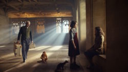
Comparison between a soft look (left) and the application in the rec color space. 709 (right)
The dilemma of looks
From the technical point of view, Both solutions are viable. The first option is logically simpler: during filming and processes prior to grading (viewing dailies and editing) the filmed image will simply be transformed into a viewing color space, normally rec709 for SDR television, (fortunately we have already left behind seeing the “washed” image in filming and editing). After grading, the necessary looks will be applied and the matching will be carried out.
For the second option We would first design the looks in the color room and then we would have several paths: first, the ACES color management system, which will allow a simplified version of the looks to travel from color room to set and the rest of the processes, in the same way that simple corrections can go from set to final color. Employing ACES No matter the programs used in filming or post-production, ACES is usually compatible with all of them. But, in exchange, the creative options for these looks will be limited to what ACES can transport and for example today we would not be able to introduce spatial corrections such as vignettes, grain, blurs, etc.
Should we work applying these looks only in the grading stage or on the contrary we must design some previous looks in pre-production in the color room and have these travel to set and the next steps of dailies, assembly, etc.?
Then there are the proprietary solutions: if we use the same program on set, laboratory and color room, DaVinci Resolve or Baselight for example, we can use the color corrections of these manufacturers (DRX files in the case of DaVinci or BLG in Baselight, or even complete projects) in which any tool in a complete set of nodes or layers: grain, vignettes, glow, blur, masks, vector color changes, everything...
In both technical solutions, with ACES or proprietary corrections from DaVinci Resolve or Baseligh, these looks can be applied to the different cameras used with output to the different HDR or SDR monitoring systems that is on set or color room. Also in both cases, ACES or solutions Baselight vs Resolve, the corrections can go to VFX so that the artists can see the look that will be applied, so that they may not have to clean up a certain area of the image that will later be very dark, for example.
Advantages and disadvantages
Logically, each path, taking the grading looks to set or not, has its pros and cons. Obviously, if the project photography does not require a grading look, but rather uses this phase only as a matching process, then the exchange of looks will not be necessary. The truth is that I think this Nowadays it is rare: There is almost always some look added in grading, at least in my experience... but it is possible.
But even if the project is going to apply these looks in grading, many cinematographers prefer to have a shoot without them to focus on other aspects of the photo. creation of the original image, without confusion with things that will come later. Furthermore, it is true that the set is not the best place where apply color corrections: You don't have the right viewing environment, you don't have the time or the tempo of post-production and is impossible to see the movie in its entirety, only loose shots are seen, so the context or timing of the sequences cannot be seen.
The consequences of this decision of not taking the grading looks to set and later will be as mentioned: the rest of the technicians will be carrying out their work with colors and contrasts that will then be will change and important people on the project, such as management and production, will not be seeing the final photographic intention on a daily basis in dailies and editing.
Yes in project post looks are applied, and the budget and technicians allow it I think it has more advantages than disadvantages make these looks travel from color to set. But using the middle ground, where the virtue.
If we decide to travel the looks from grading to set, creative communication will theoretically be better, but we will have to do a more elaborate pre-production process, in order to find those looks between the different departments and then it will be technically more complete to carry out the exchange and monitoring of those looks shot by shot throughout all the filming and post-production processes.
Besides, we run the risk of getting lost on set and start playing with the image in moments where we must be focused on the quantity, quality and direction of light. Losing focus of what is necessary with what is accessory. It can even show a negatively altered image to management and production if we are not clear about what we are doing and how to carry it out. I have had cases of producers who have asked me about the state of the original material when watching dailies negatively manipulated on set.
And my opinion about all this? Well, as in most cases, there is no single answer. Each project, with its workflow and especially with the professionals that make it up, means that one path or another must be applied.
If the project does not have grading looks or due to its budget or complexity it does not have the possibility of creating a workflow in which the looks travel correctly, I think it is better to be conservative and work on set, dailies and editing with traditional conversions to rec709.
But if post looks are applied in the project, as I say, increasingly common, and the budget and technicians allow it I think there are more advantages than disadvantages of making these looks travel from color to set. But using the middle ground, where virtue is supposed to be.
The importance of pre-production
The experience It has shown me that if you do an adequate job of creating looks in the color room in pre-production, you really save time in the design phase. final grading and the creative communication between all departments during the filming and editing processes is better.
For this, I consider that the looks that are created in pre-production in color room they must be solid and not very extreme, so that they hardly need to be manipulated on set as they adapt well to different cameras, lighting situations, etc. The more extreme they are, the worse they will adapt to most filming situations and the more they will need to be manipulated on set, potentially breaking in this process.
The good thing about our profession is that every day and every project presents us different challenges and solutions. Therefore, with the theme of these looks, sometimes you have to try and others it is better to be conservative.
Generally, I think it's better than these looks do not manipulate exposure or do so in a subtle way, in order not to confuse the director of photography. Likewise, I think They should not introduce very pronounced color dominants especially if they are dominant throughout the image, unless it is a specific request, to interfere as little as possible with the original color temperature and not “heat twice” for example. Yes, I think it's good that these looks have the palette changes that have been chosen and the subtle partial color casts if any, so that art, costume, etc. professionals can see the changes and communicate better.
Carry out more drastic makeover changes, such as adding money, blurs or masks I think that, depending on the cases, it can bring more problems than advantages. Since grading in pre-production is difficult to generate looks with these elements that work well in the multiple shots shot and I think that the set is often not the place to do such fine adjustments. At least, that is my thinking today guided by my experience.
The good thing about our profession is that every day and every project presents us different challenges and solutions. Therefore, with the theme of these looks, sometimes you have to try and others it is better to be conservative. In any case, you already know: to taste... colors.
Luis Ochoa
Image post-production director Drago (Sequoia Group)

Did you like this article?
Subscribe to our NEWSLETTER and you won't miss anything.
Related articles
 RTS television migrates its grading processes to DaVinci Resolve
 'Nuances': a journey into the patient's mind through color grading
 DaVinci Resolve, chosen for grading of 'Reality' (HBO Max)
 'The Communion Girl': a grading at the service of terror
 VSN analyzes where we come from and where we are going in 2020
 Technicolor uses Baselight in grading the HBO series 'His Dark Materials'
 Pigment switches to DaVinci Resolve for HDR and IMF grading
 Create, control and connect content where, how and when it is consumed... with Grass Valley
 The Mexican post-production company Oxido incorporates grading on Filmlight's own filming set
 CineOnLine, a new platform to watch first-run movies wherever, whenever and however you want
 'Pacific Rim', the secrets of its grading with colorist Maxine Gervais
 The science of color: color grading with Jaime Climent
 LaSexta On: TV where, how and whenever you want
 Radio 2.0 at full voice… how, where and whenever you want