


TPA news debuts graphic image and decoration
TPA Noticias renews its image, completing the continuity image change that the Asturian network began last June. The set will be transformed chromatically to visually differentiate the character of the news.

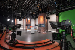
TPA has renewed the graphic design and decoration of the information services starting tomorrow, Friday, September 25. The new set is developed in an environment where the news set is integrated with the writing area, conceived as a single space whose objective is to transmit transparency and modernity.
TPA Noticias 2 presenta como novedad la incorporación de un tercer presentador con el objetivo de dinamizar el ritmo del espacio. La pieza más original del set es la mesa de los presentadores, donde destaca una línea recta que tiene la finalidad de simbolizar fuerza y pureza. Además, su protagonismo se hace patente mediante la iluminación en led con cambio de color. La conexión entre el plató y la redacción se resuelve mediante un paramento de vidrio inclinado que transmite profundidad al espacio.
The use of cutting-edge audiovisual technology stands out. The space is transformed chromatically to visually differentiate the character of the news. The final result is a functional environment at the service of information.
 New graphic design
The new graphic line of TPA Noticias completes the continuity image change that the chain began last June. It is a more technological design, which conveys greater sobriety, and whose objective is to give all the importance to the news. The proposal has two forms that coexist at a conceptual and aesthetic level, on the one hand the continuity part of the channel and on the other the channel identifiers, which are already shown on the channel.
Para la continuidad se ha modificado el logo de TPA mediante planos rectangulares que se sobreponen y cruzan. Partiendo de estos planos se ha diseñado un sistema de ejes giratorios que sirven como sustento gráfico para rotular, realizar transiciones y traer una imagen a pantalla.
A la gama de color se han introducido azules provenientes del logo de RTPA. La aplicación de los colores en los planos giratorios conlleva un degradado y una opacidad que al solaparse unos con otros, crea un color más sólido. El cambio de la tipografía radica en una estructura más extendida que facilita la lectura.
Los identificativos de cadena tratan de evocar sentimientos, emociones y sensaciones a través de la contemplación y de planos con movimientos muy sutiles, donde se verán elementos y situaciones que evoquen el origen de Asturias, de su paisaje, su clima y su orografía.
Did you like this article?
Subscribe to our NEWSLETTER and you won't miss anything.
Related articles
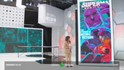
 Telecinco renueva imagen gráfica con cortinillas en slow motion y un innovador modo noche
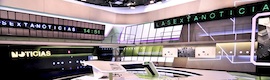
 'LaSexta Noticias' launches an avant-garde set equipped with the most innovative technology
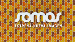 El canal de televisión de cine español Somos estrena nueva imagen
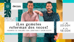 Canal Decasa estrena nueva imagen
 AEQ renews its corporate image and opens an office in India
 Radio Bremen estrena un innovador estudio que combina eficazmente imagen real y virtual
 Canal Hollywood cumple 25 años y estrena nueva imagen
 Telemadrid launches corporate image and new news programs
 Estructure launches Kosmos, its platform for news production
 Panorama renueva su imagen gráfica
 LaSexta Noticias changes its image
 Viajar emite en 16:9 y con nueva imagen gráfica