




Telecinco renews graphic image with slow motion curtains and an innovative night mode
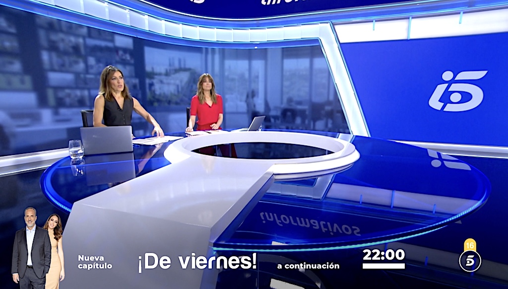
Simplicity, uniformity, clarity and simplicity are the keys that structure the new graphic line of Telecinco, which will be on air starting this Monday, September 2, and which incorporates a new night mode - similar to that implemented in mobile devices and digital applications - in the continuity developments that are broadcast from 9:05 p.m.
The starting point for the development of this renewed corporate image has been the channel's logo, which maintains its essence and its modern and dynamic character by using white as a unified color and a transparent circle inside instead of the blue sphere. The logo has also served as inspiration for the creation of a new line and custom typographic styles and the use of a new corporate blue background.
The new graphic line of the channel is characterized by the following key concepts: simplicity (the brand, mentions of its presenters, programs and series and appointments with the audience are shown in the clearest and most simplified way possible), uniformity (the new identity converges in a single style applied to the entire ecosystem of information that the channel offers on screen to viewers about its programming) and clarity (the pieces, texts, graphics and images of the presenters are shown with the utmost cleanliness, simplicity and quality on screen, avoiding artifice).
Simplicity and dynamism
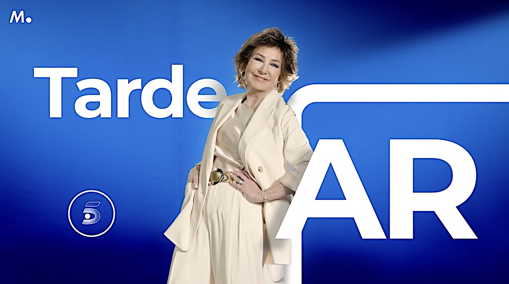
Absolutely identifiable and recognizable for the Spanish audience, the Telecinco logo maintains all its essence, simplifying the sphere that has surrounded it until now until it becomes a transparent circle inside, a shape that reinforces the concepts of unity, group and belonging.
Another novelty in this sense is the color unification: the blue of the dial gives way to white both on the circumference and on the 5 of the channel. The clean, circular shape of the logo will only be momentarily modified when it is necessary to communicate to viewers the age ratings of the content and the accessibility services available.
In line with the logo, All program and series logos have been reinterpreted of the chain, using white as a unified color for all of them. In this way, simplicity, simplicity and readability for the viewer are reinforced.
A pioneering curtain campaign
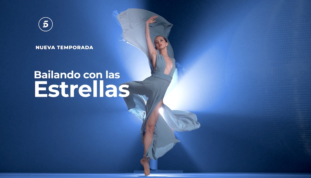
The comprehensive relaunch of Telecinco's corporate image includes the premiere of a curtains starring its main presenters and the formats that define the channel's programming at the start of the new season. As an absolutely distinctive element of these pieces, their protagonists appear in motion with a slow motion effect that substantially increases the impact and attention on them.
After being part of fun filming sessions with the creative team in charge of its design, development, production and post-production, Jorge Javier Vázquez, Ana Rosa Quintana, Carlos Sobera, Ion Aramendi, Sandra Barneda, Carlos Franganillo, Emma García, Joaquín Prat, Carlos Latre, Ana Terradillos, Santi Acosta, Beatriz Archidona and Risto Mejide are the main protagonists of these new chain identification curtains, both in day mode and in night mode, which will begin to 'splash' from this Monday on the channel's different programming slots.
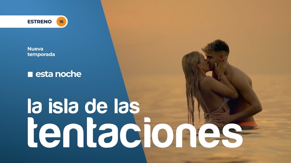
Modos Day & Night
Among the great novelties of Telecinco's new corporate image, the creation of two styles - one daytime and one nighttime - depending on the time and time of day in which the different continuity pieces are broadcast. Emulating the dark modes or themes already fully implemented in the interfaces of mobile devices and digital applications, which allow a reduction in visual fatigue and light exposure, among other benefits, Telecinco has adapted the background of the different graphic and visual elements, which will be different if they are broadcast before or after 9:05 p.m.
During day time, continuity elements will be broadcast in day mode on a blue background with a light gradient. Starting at 9:05 p.m., the moment when the main news program starts, which in turn gives way to prime time content and formats, the night mode will be automatically 'activated', using a gradient blue background with a darker tone. In both modes, certain pieces may include the use of volumetric lights to enhance the images of their presenters or the figures of their protagonists.
New line and typographic styles
This redesign has also generated the development of a new typographic line, made up of two fonts and different personalized text styles for each type of piece and graphics, providing greater coherence and simplicity to all of the channel's graphics. The new fonts are Harabara, used in content titles, in mentions of presenters or protagonists or when it is necessary to highlight a headline; and Montserrat, used for appointments, schedules and smaller texts.
The new Telecinco anagram is inspired by the shape and angles of the upper part of the five of the channel's logo, starting from a base typography (sans serif) in lower case and simplifying the C of 'five' to convey a feeling of greater closeness to the viewer.
Did you like this article?
Subscribe to our NEWSLETTER and you won't miss anything.
Related articles
 Proton develops a mini camera for Slow-Motion with 240 fps
 VSN renews its corporate image with a young, modern and innovative look
 For-A to debut FT-One-LS-12G Full 4K Super Slow-motion camera at NAB Show
 Radiotelevisione Svizzera (RSI) received a new Super Slow Motion Van from Broadcast Solutions
JVC will incorporate slow motion in its GY-LS300 4K camera
Radiotelevisione Svizzera (RSI) received a new Super Slow Motion Van from Broadcast Solutions
JVC will incorporate slow motion in its GY-LS300 4K camera
 JVC updates its 4K cameras including slow motion with 120 fps recording
 The I-Movix X10 ultra-slow motion camera, now with a wireless option
 Panorama renews its graphic image
 Slow-motion replays, now in 4K, at NAB 2013 from EVS
 Slow-motion brings the WWF photographic fund to life
 Improvements to the X10 and SprintCam Vvs HD slow-motion systems
 Slow Motion Effect in Avid with Twixtor 5
 VFC-7000: For-A's new super-slow-motion, ready for summer
 Important new features in the I-Movix Ultra-Slow-Motion SprintCam