


Antena 3 renews its image
El diseño mantiene su símbolo pero reinventa su forma para presentar un logotipo aún más amable, natural y cercano. El triángulo interior del logotipo gana protagonismo como elemento clave para las piezas de continuidad como pathfinders, moscas promocionales, promos…
Antena 3 siempre se ha mantenido cercana a la audiencia, adaptándose a los gustos y demandas de los espectadores y ofreciéndoles la máxima calidad y originalidad en sus contenidos. Ahora, da un paso más y lanza la renovación de su consolidada identidad para acercarla más a su audiencia. Un logotipo que mantiene su símbolo pero que reinventa sus formas con un diseño más amable y cómplice con el espectador.
 Diseñada por el Departamento de Imagen y Creatividad de Atresmedia, que dirige Juan Ramón Martín Muñoz, la nueva imagen también cuenta con una actualización de las piezas gráficas para sus campañas promocionales y continuidad del canal.
Si el símbolo de Antena 3 ha demostrado, durante todos estos años, que no pasa de moda y que llegó para instalarse en el imaginario de todos, ahora es aún más redondo.
Esta evolución del diseño presenta una imagen más flexible, dulce y amigable con la única intención de convertirse en un elemento todavía más familiar.
Para el nombre de la cadena se ha apostado por una tipografía también más redondeada, acorde con el nuevo logotipo que imprime a la marca un carácter más distendido y directo, con un guiño simpático en las curvas de las serifas.
 El triángulo, protagonista
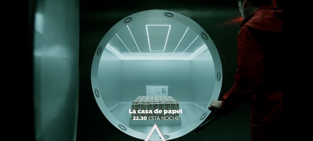
Es ya el símbolo por excelencia de Atresmedia y casi un icono para sus canales. El triángulo ha estado desde el comienzo presente en Antena 3, aunque no siempre se haya identificado. Ahora, el interior del logotipo de Antena 3 cobra protagonismo como elemento clave en las piezas de continuidad y promoción del canal. La evolución de la imagen corporativa se extiende, por tanto, a todos los elementos de gráficos de la cadena: autopromos, cortinillas, pathfinders, identificadores, moscas promocionales…
En muchas de estas piezas veremos el triángulo como indicador que dará paso a titulares, convocatorias, claims… en una renovada estética promocional que apuesta por la presencia total de la imagen en pantalla con transiciones ágiles y dinámicas que dotan de mayor ritmo a los contenidos. Aunque el logotipo que se presenta es más redondeado, los elementos de continuidad adoptan un diseño más geométrico, acorde a la identidad de otros diseños del grupo
Imagen colorista
El color naranja sigue siendo la seña de identidad de Antena 3, pero ahora se enriquece más. La cadena abres su abanico a una mayor variedad cromática para ofrecer una imagen más colorista y diversa, como lo son sus contenidos. De esta manera, junto al naranja, nuevos colores se incorporan a la imagen corporativa como fondos y piezas de continuidad que ayudan a resaltar el carácter del logotipo.
Did you like this article?
Subscribe to our NEWSLETTER and you won't miss anything.
Related articles
 DocumentaMadrid turns 15 and renews its image
 LaSexta renews its image coinciding with its tenth anniversary
 TVE renews image, programming and content management
 Antena 3 renueva con Bambú producciones una nueva temporada de ‘Velvet’
 Antena 3 and Neox renew their image
 Panorama renews its graphic image
 ‘Espejo Público’ renews set and image
 Autodesk renews its brand image
 Antena 3 renews its intercom with Riedel technology
 Antena 3 renueva microfonía con Sennheiser
 Antena 3 renews its image with fresh continuity
 Antena 3, the channel with the best image and most valued by Spaniards
 Antena 3 renews its website thinking about a multi-support and multi-platform concept
 TPA celebrates three years on the air and renews its image