


Antena 3 renueva imagen con una fresca continuidad
La nueva continuidad de la cadena española se centra en tres ejes principales: luz, el color y el brillo, y se verá reflejada en elementos identificativos, navegadores 3.0, cierres de promo, crawl, pathfinder y copy. Antena 3 re-estiliza también su logotipo que ha sufrido varias modificaciones a lo largo de sus dos décadas de vida.

Coincidiendo con el estreno de su ambiciosa serie El barco, Antena 3 estrena este lunes en prime-time una innovadora imagen corporativaque afectará tanto a su continuidad como al propio logo de la cadena.
La estética de la continuidad que Antena 3 pone en marcha ahora, elaborada por el estudio Vida en Marte junto al departamento de grafismo de Antena 3, está marcada por la luz, el color y el brillo. manteniendo el color naranja que representa energía y alegría. Como principal novedad los elementos visuales aparecen sobre fondo de cristal para dar calidad y carácter premium en la era del HD y 3D.
La nueva imagen opta por formas orgánicas y corpóreas tridimensionales, frente a la inmovilidad de las formas planas que se emplean actualmente en televisión.
Los espectadores verán, a partir de este lunes, que todos estos innovadores elementos visuales aparecerán en pantalla de una manera fluida e integrada en las emisiones tanto grabadas como en directo.

Nuevo logo
A lo largo de sus dos décadas de vida, Antena 3 ha ido modificando su logo inicial, en muchas ocasiones coincidiendo con cambios accionariales. Antena 3 Tv inició sus emisiones en época de Manuel Martín Ferrand con una ligera adaptación del rojiblanco logo de Antena3 Radio.
En septiembre de 1992, coincidiendo con la llegada de Banesto a la cadena, el logo cambia adoptando los colores corporativos y formas onduladas del banco en rojo, azul y amarillo. Ya en 1997 con la entrada de Telefónica se lleva a cabo un nuevo rediseño conservando la forma pero en tonos azules propios de la operadora.
En 2003 se introdujeron algunas ligeras modificadores, alternando durante todos estos años hasta hoy diversas tonalidades que han ido del desde el blanco al naranja pasando por el gris.
Ahora, se acentúa la forma de flecha primando frente a la “A” interior manteniendo el naranja como color corporativo.

Did you like this article?
Subscribe to our NEWSLETTER and you won't miss anything.
Related articles
 35 años de emisión en Antena 3: de la primera LMS, al estreno de su nueva continuidad
 Telecinco renueva el diseño de autopromociones y continuidad
 La 7 renueva su archivo, continuidad y planificación de contenidos con VSN
 Mediapro Motion realiza el restyling de la imagen y continuidad del canal Ten
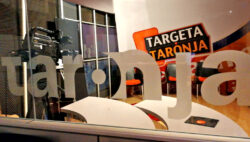 ICC Broadcast renueva Canal Taronja con continuidad automatizada de Estructure
 RTVE renueva la continuidad de Torrespaña con equipos Albalá
 Antena 3 renueva su imagen
 Imagen Televisión inicia sus emisiones en México con los sistemas de continuidad de VSN
 ‘Espejo Público’ renueva plató e imagen
 TV Benavente renueva su continuidad con el software Channel Maker de wTVision
 Antena 3 renueva microfonía con Sennheiser
 Telemadrid renueva su continuidad con servidores Nexio de Harris
 Antena 3, the channel with the best image and most valued by Spaniards
 TPA cumple tres años en antena y renueva su imagen