


Telecinco renews the design of self-promotions and continuity
Bajo el claim ‘Al ritmo de tu vida’, Telecinco estrena una nueva línea de autopromociones y continuidad en antena con el objetivo de potenciar su imagen de marca con nuevos recursos visuales y sonoros que unifiquen su imagen on air a través de una propuesta muy luminosa.
To Manuel Villanueva, director general de Contenidos de Mediaset España, “Telecinco se caracteriza por ser una televisión viva, alegre y cercana a los espectadores. Y son precisamente en estos atributos en los que nos hemos inspirado a la hora de diseñar esta nueva línea gráfica de continuidad y autopromociones con la que vamos a anunciar de una forma dinámica, muy visual y reconocible las citas fijas con nuestros contenidos cada día de la semana. De manera clara, unificada y homogénea, con un guiño a los nuevos lenguajes, la nueva forma de comunicarnos con nuestro público la hacemos teniendo en cuenta también que en televisión, en tablet o en móvil, Telecinco se adapta ‘Al ritmo de tu vida'”.
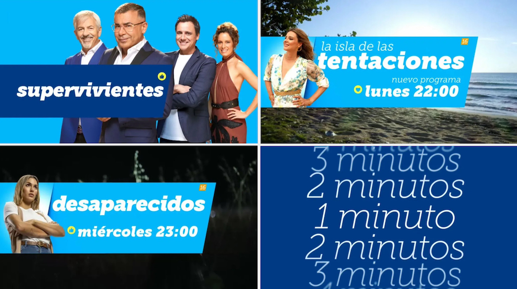
Las características que la nueva línea gráfica de autopromociones y continuidad engloban unas premisas conceptuales y estéticas claras, con una imagen luminosa y totalmente identificativa del canal con el color corporativo de Telecinco de fondo; rótulos de gran tamaño ocupando la parte central de la pantalla para fijar la atención del espectador; mensajes directos con cierres sencillos en los que la información importante es el centro de atención; un cierre final con su nuevo claim Telecinco, al ritmo de tu vida en promos y cortinillas; y una identidad visual unificada aplicada al resto de los elementos: pathfinders, avances, bumpers, moscas, paso a publicidad y duración de bloques, entre otros.
Las autopromociones siempre abrirán con un carrusel que ubica temporalmente en el momento en el que se va a emitir el contenido, para que el espectador retenga con facilidad la cita con el espacio promocionado. Junto con las imágenes del contenido, los rótulos aparecerán siempre centrados en la pantalla, fijando toda la atención de la información: puede dar información del tipo “estreno”, “vuelve” o “final”.
He cierre de las promos aportará por su parte la información con el nombre del formato, programa o serie, el día y la hora de emisión. Habitualmente, incluirá fotografías de sus presentadores y/o actores para potenciar la presencia de los rostros de la cadena. También puede incorporar, de forma no invasiva, la calificación de edad del contenido.
Como novedad, el nuevo grafismo de Telecinco introduce un guiño al lenguaje icónico de los emoticonos, extendidos entre las nuevas vías de comunicación de las nuevas generaciones, sobre un fondo amarillo, un nuevo color que entra en la paleta cromática de los tonos habituales de la cadena por su aportación de vitalidad y energía, con el “azul Telecinco” como color predominante de toda la línea gráfica junto a otras declinaciones de azul, más identificativo con el color corporativo de Mediaset España, y el blanco para los textos. Estos iconos circulares, que contendrán de forma aleatoria símbolos como un corazón, una estrella, una mano con el pulgar hacia arriba, un aplauso, una casa, un asterisco y una exclamación servirán además de transición a la icónica bola que incorpora el logotipo de Telecinco.
La tipografía utilizada es la Museo Slab, seleccionada por su sencillez y legibilidad. Se utiliza en su versión cursiva, para sumar otro elemento de movimiento y dinamismo. Siempre en minúsculas, exceptuando los nombres propios, haciendo un guiño al modo actual de la comunicación de los jóvenes.
Did you like this article?
Subscribe to our NEWSLETTER and you won't miss anything.
Related articles
 Telecinco renews graphic image with slow motion curtains and an innovative night mode
 La 7 renueva su archivo, continuidad y planificación de contenidos con VSN
 Blackmagic renueva los cuatro HyperDeck Studio con un nuevo diseño y más funciones
 ICC Broadcast renews Canal Taronja with automated continuity from Estructure
 SES will provide IP and continuity services to more than 50 BBC Studios channels
 RTVE renews the continuity of Torrespaña with Albalá teams
 Competencia expedienta a RTVE y Mediaset por exceso de autopromociones
 Aragón TV entrusts its continuity to VSN solutions
 LuxorVS400: realización y continuidad en una única solución
 Las autopromociones: un género televisivo desconocido pero imprescindible
 TV Benavente renews its continuity with wTVision's Channel Maker software
 Cuarzo TV renews with Telecinco for three years
 Telemadrid renews its continuity with Nexio servers from Harris
 Antena 3 renews its image with fresh continuity