





Mediapro Motion carries out the restyling of the image and continuity of the Ten channel
Ten's new image is more innovative, attractive and fresh in which the color palette adapts to new design trends with a more pop appearance.
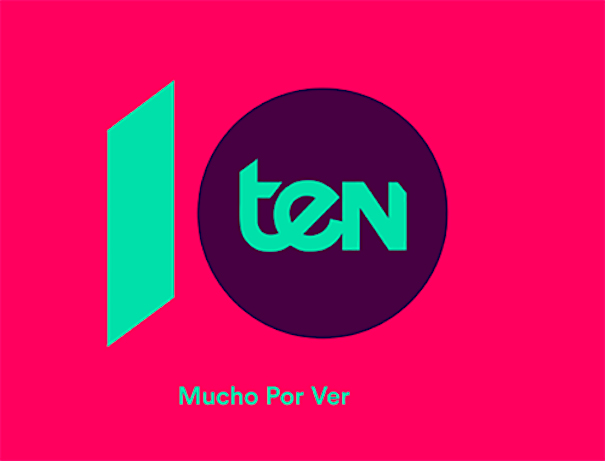
Ten has started 2021 presenting its new corporate image. The DTT channel, also available on operators such as Movistar, Vodafone, Telecable and Orange, among others, just released its new image, more innovative, attractive and fresh in which the color palette adapts to new design trends with a more pop appearance.
The transformation of Ten's image has been carried out entirely by the design team of Mediapro Motion, who have been in charge of restyling the logo and creating all these new graphic elements of continuity. In addition to the channel logo, new on-air graphic elements are incorporated, such as the text fly or pathfinders, which allow information about programming to be shown to the viewer in a dynamic and non-intrusive way.
In all the graphic universe created is played with the name of the channel and the number it represents by including geometric elements such as trapezoids and circles.
https://www.youtube.com/watch?v=u8FbMeNdj_0
Did you like this article?
Subscribe to our NEWSLETTER and you won't miss anything.
Related articles
 Telecinco renews graphic image with slow motion curtains and an innovative night mode
 Mediapro makes and broadcasts 'Red Bull Click', The Grefg format that mixes film and video games
 The Movistar Plus+ Toros channel ceases its broadcasts as its continuity is not viable
 Channel 33 (CCMA) is reborn with a new image and renewed programming
 ICC Broadcast renews Canal Taronja with automated continuity from Estructure
 The Spanish film television channel Somos premieres a new image
 Canal Decasa launches new image
 Canal Hollywood turns 25 years old and releases a new image
 VSN solutions drive automation in the new Mexican channel Imagen Televisión
 Imagen Televisión begins its broadcasts in Mexico with VSN continuity systems
 Mediapro migrates the Portuguese channel Porto Canal to HD
 Mediapro will return the Gol T channel to Atresmedia on July 1
 Antena 3 renews its image with fresh continuity
 New image of the Santander corporate channel