
Autodesk renueva su imagen de marca
Un nuevo logotipo es el cambio visual más importante en la historia de la compañía en tres décadas.
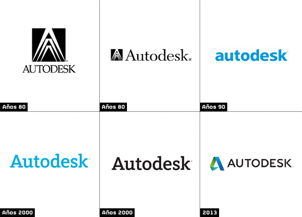
![]() Con un cambio radical de su logotipo y nueva tipografía, Autodesk ha renovado su imagen de marca. La multinacional norteamericana incorpora por vez primera un icono al logo, que desde su origen y en las diferentes versiones ha utilizado en el nombre de la marca en distintas tipografías.
Con un cambio radical de su logotipo y nueva tipografía, Autodesk ha renovado su imagen de marca. La multinacional norteamericana incorpora por vez primera un icono al logo, que desde su origen y en las diferentes versiones ha utilizado en el nombre de la marca en distintas tipografías.
Diseñado “in house” y presentado en el marco de las Conferencias TED, el nuevo logo se ha inspirado en el Origami (arte japonés que supone la quintaesencia de la papiroflexia) que representa la convergencia entre el arte y la ciencia, la forma y la función.
La nueva identidad refleja conceptos tridimensionales y de movimiento. El logotipo incluye un símbolo ‘A’ que está en consonancia con las tendencias más recientes en el diseño de logos, más volumétricos, utilizando gradientes y curvas yuxtaposición con bordes duros y esquinas.
Tanto el icono como la marca asociada cuentan con una paleta más ligera que la anterior identidad, realizada en 2006. Asimismo, el equipo de diseño de Autodesk ha creado diferentes iconos que simulan capturas de elementos en movimiento que identifican las diferentes áreas y sectores a los que se dirigen sus productos.
El nuevo logo y su aplicación es el cambio visual más importante en la historia de la compañía de 30 años, si bien desde 1982 se han venido realizando cambios sutiles en temas como el color y las imágenes: desde el icono de pinzas original (un compás utilizado para medir la distancia entre dos lados opuestos de un objeto) a la utilización del nombre de Autodesk. Nuestra nueva identidad visual incluye un logotipo con el nombre de Autodesk, por primera vez en más de una década.
Did you like this article?
Subscribe to our NEWSLETTER and you won't miss anything.
Related articles
 Mondo TV Studios renueva su pasión por la animación bajo la marca Hi Animation
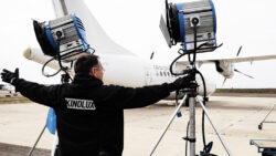 Kinolux transforma su imagen de marca para consolidar su presencia en la ficción española
 LaLiga+ mejora en usabilidad, experiencia de usuario y diseño siguiendo la nueva imagen de marca
 ETB renueva su imagen corporativa con motivo de su 40 aniversario
 Visionarea Event Solutions cambia su marca e imagen y será ahora Octo Events Productions
 DocumentaMadrid cumple 15 años y renueva su imagen
 Antena 3 renueva su imagen
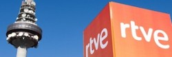 TVE renueva las direcciones de imagen, programación y contenidos
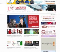 Panorama renueva su imagen gráfica
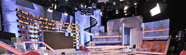 ‘Espejo Público’ renueva plató e imagen
 RTVE y Marca España colaborarán en la promoción de la imagen del país
 Antena 3 renueva imagen con una fresca continuidad
 Zeligstudio diseña la imagen de Marca Tv