





Hispasat and Hispamar renew their corporate image, homogenizing both brands
The work has been carried out by the Madrid studio Azento de Diseño and tries to reflect the growing internationalization of the company.
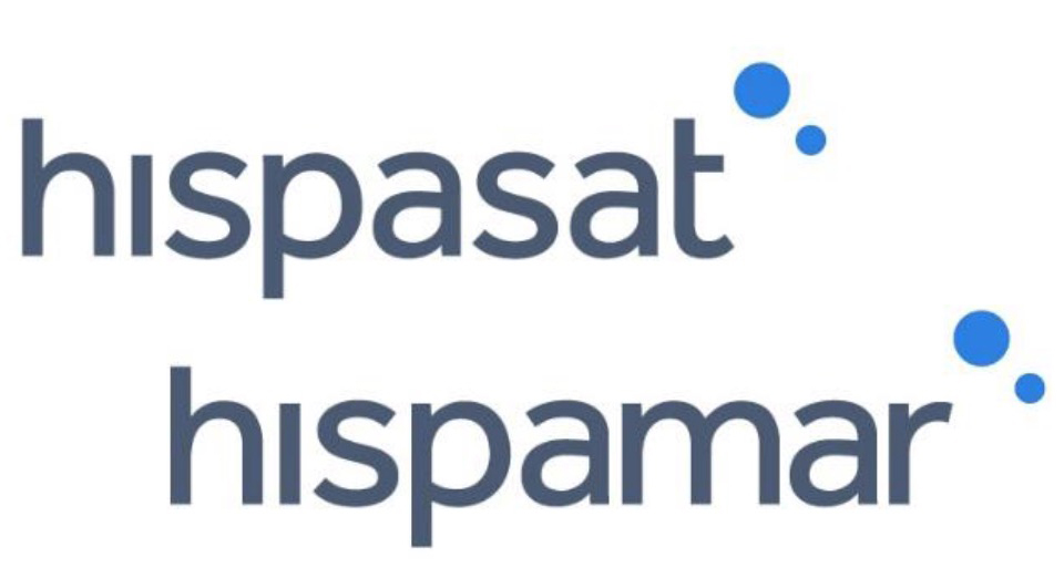 Hispasat and its Brazilian subsidiary Hispamar Satélites have renewed their corporate image in order to unify both brands and modernize their logo. The modification has been carried out after 16 years of validity of the previous logo, during which many changes have occurred both in society as a whole and in the satellite sector and in the company itself, which has gone from being an eminently Spanish operator, with one orbital position and three operational satellites, to becoming a very internationalized company, with a fleet of nine satellites located in six orbital positions and with a new corporate culture based on the introduction of new values and new markets, services and technologies.
The new logo responds, therefore, to these changes and seeks to modernize the image of both companies through a chromaticism more related to the technological field and adapting it to a more current aesthetic, as well as to reflect the growing internationalization of the company by adopting greater homogeneity between the corporate images of Hispasat and Hispamar: a single Spanish-Brazilian identity.
Homogeneity, modernity and internationality
Azento de Diseño has worked on these three principles (homogeneity, modernity and internationality) to define a new logo that, based on the previous one, would maintain some of the company's identity features. The image has been simplified, eliminating the final symbols in both cases to achieve a more synthetic and integrated logo, in line with current trends, and the typography of the logo has been unified and personalized, which has acquired greater thickness in order to give more weight to the company name. Finally, the dot of the “i” with its symbol has been moved to the end, representing the Earth and the satellite.
As for the color range, a bluish gray was chosen for the logo, which has its origin in the previous colors of both brands and denotes responsibility, rigor, seriousness and professionalism. The symbol of the two circles is bright blue, a cold and serene color that is associated with the world of technology and that represents progress and modernity.
Did you like this article?
Subscribe to our NEWSLETTER and you won't miss anything.
Related articles
 Broad Service celebrates its 20th anniversary with new corporate image
 Ebantic renews its corporate image coinciding with its tenth anniversary
 Audinate renews its corporate image and that of the Dante platform
 APPA celebrates its 20th anniversary with a new corporate image
 VSN renews its corporate image with a young, modern and innovative look
 Hispasat increases its shareholding in Hispamar Satélites to 100%
 ETB renews its corporate image on the occasion of its 40th anniversary
 Hispasat and the Gran Teatre del Liceu renew their collaboration agreement for the transmission of operas via satellite
 The Official College and the Spanish Association of Telecommunications Engineers launch their new corporate image
 AEQ renews its corporate image and opens an office in India
 Telemadrid launches corporate image and new news programs
 Trece begins the season with a change in its corporate image
 Broadcast Products targets the Latin American market with new corporate image and sales team
 Antena 3 and Neox renew their image