


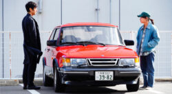
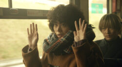
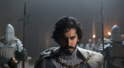
The dramatic dystopia 'The Fortress' (Viaplay), graded with DaVinci Resolve Studio
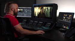
El colorista Dylan Hopkin decidió aposta por el software DaVinci Resolve Studio de Blackmagic para etalonar y finalizar ‘The Fortress’ (Viaplay), premiada serie noruega ganadora del premio a Mejor guion en Series Manía.
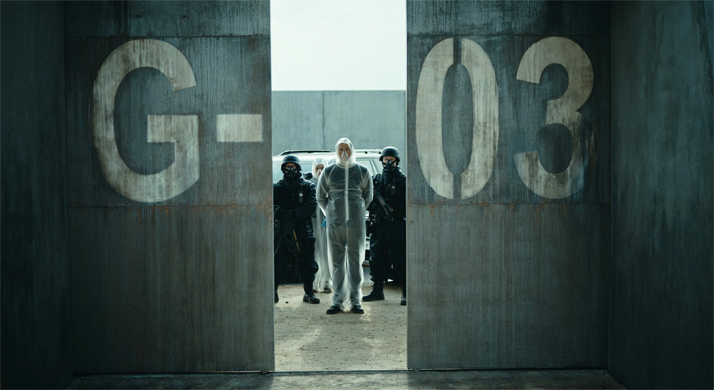
He drama distópico of seven episodes of 45 minutos cada uno protagonizado por Russell Tovey (Years and Years) se adentra en el año 2037, momento en el cual Noruega decide cortar con todo tipo de lazos internacionales y construye una muralla enorme en su perímetro. Inicialmente prosperando en su aislamiento, el destino de Noruega toma un giro peligroso cuando se ve atacada por una enfermedad mortal, convirtiendo la fortaleza una vez protectora en una trampa ineludible.
Produced by Maipo Film para Viaplay y filmada en Noruega y Lituania, la posproductora Nordic Film ShortCut Oslo estuvo a cargo del conformado, el etalonaje y la finalización de la serie con DaVinci Resolve Studio. Además, fue responsable del diseño de sonido y la masterización, mientras que Troll VFX en Finlandia realizó los efectos visuales.
La serie contó desde un inicio con un estilo visual “metálico”, con un contraste altamente ajustado y un énfasis en los reflejos. Este enfoque, reforzado en la corrección de color con un efecto de cinta analógica, alcanzó humanidad con el añadido de “imperfecciones” utilizando las curvas personalizadas de DaVinci Resolve Studio y las secuencias de comandos DCTL para imitar la transferencia entre los canales de color. “Las imágenes respiran más cuando ciertas partes del rango tonal se alejan del centro ligeramente. De lo contrario, puedes terminar con una apariencia poco inspiradora”, explica Hopkin.
Técnicas de DaVinci en The Fortress
Hopkins dedicó un total de 36 horas de etalonaje por episodio de ‘The Fortress’ empleando una amplia selección de herramientas de DaVinci: “Apliqué sutilmente la herramienta de refinamiento facial para mejorar la luz en los ojos de los actores, de modo que el público se sintiera más conectado con los personajes en momentos importantes. También hubo un par de escenas en las que un policía uniformado llevaba un sombrero con una mezcla de telas negras y azul oscuro, por lo que tuvimos que etalonar el azul para que coincidiera con el negro. Esto puede sonar como una tarea sencilla; sin embargo, las cualidades refractarias del área azul oscuro eran mucho más brillantes que las áreas negras, y los rangos de luminancia más oscuros eran muy similares”.
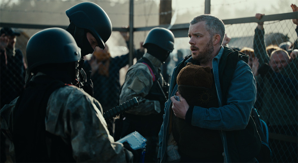
El etalonador también utilizó la máscara de objeto en la función Máscara mágica and one Power Window para separar las áreas negras y azul oscuro, así como el efecto de mapa de profundidad para añadir detalles en el ambiente: “Hacia el final de la temporada, hay una escena que se desarrolla en un campo de refugiados. Había muchos refugiados, guardias y hogueras llameante con cantidades variables de humo en toda la secuencia. Ocasionalmente generé mapas de profundidad con dicho efecto para obtener una mejor toma al igualar las imágenes con las tomas en exteriores. Dejé que eso guiara la visibilidad de la neblina creada con el efecto de ruido rápido. Esto me ayudó a lograr una mejor continuidad atmosférica”.
“Espero que el etalonaje no se perciba, en el sentido de que no debería competir con la historia, sino subrayarla. Al principio de la serie, hay sutiles diferencias entre las dos ubicaciones. Sin embargo, hay una ligera sensación de incertidumbre, incluso en la abundante frescura de Noruega”, concluye Hopkins.
Did you like this article?
Subscribe to our NEWSLETTER and you won't miss anything.
Related articles
 ‘Extremely Inappropriate!’, the TBS drama series, uses DaVinci Resolve Studio in its grading
 The Mexican series 'Somos Oro' (Amazon Prime), graded with DaVinci Resolve Studio
 Spotify's new advertising campaign graded with DaVinci Resolve Studio
 ‘The Walking Dead: Daryl Dixon’, etalonada con DaVinci Resolve Studio
 'Drive My Car', Oscar for Best Foreign Film, graded with DaVinci Resolve Studio
 ‘Don’t Call It Mystery’ (Fuji TV), etalonada con DaVinci Resolve Studio
 The 'Pagan Peak' series (Sky Deutschland) graded with DaVinci Resolve Studio
 'Don't look up' (Netflix), graded with DaVinci Resolve Studio
 ‘Red Alert’ (Netflix), graded with DaVinci Resolve Studio
 ‘The Green Knight’, etalonada con DaVinci Resolve Studio
 The third season of 'Brassic' (Sky), graded with DaVinci Resolve Studio
 'Gaey Wa'r', graded with Blackmagic Design's DaVinci Resolve Studio
 ‘Normal People’, the BBC and Hulu adaptation, graded with DaVinci Resolve Studio
 The ‘Please Tell Me I’m Adopted!’ series, edited and graded with DaVinci Resolve Studio