


‘Red Alert’ (Netflix), graded with DaVinci Resolve Studio
DaVinci Resolve Studio de Blackmagic Design ha sido el programa elegido para la corrección de color de Alerta Roja, una de las últimas producciones de Netflix.
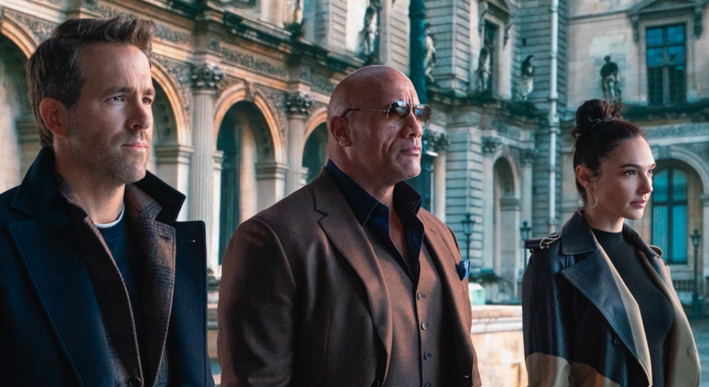
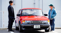
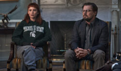
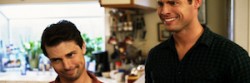
Alerta roja, una aventura sobre delitos internacionales, sigue al agente del FBI John Hartley (Dwayne Johnson) mientras persigue al ladrón de arte Nolan Booth (Ryan Reynolds). Hartley se ve obligado a unirse a Booth a fin de capturar a “El alfil”, una ladrona de arte elusiva que intenta robar un artefacto de valor incalculable conocido como los huevos de Cleopatra. La película, rodada por Markus Förderer, ASC, propone un viaje por localizaciones tan diversas como Roma, Valencia o las selvas de Argentina.
El rodaje de la película se produjo en un momento en el que no era posible viajar en avión y, mucho menos, llevar a cabo una producción cinematográfica de estas dimensiones. Tal y como recuerda Förderer: “Tuvimos que replantearnos cómo grabar una película que recorre todo el mundo. Sin la posibilidad de ir al exterior, terminamos creando la mayor parte de los sets en distintos espacios enormes y en los estudios en Atlanta. Estas escenas luego se montaban con planos de situación, que fueron captados con un equipo reducido en los lugares en cuestión”.
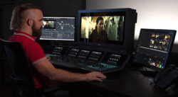
Partiendo de esta base, el desafío era evidente: conjugar los distintos elementos que compondrían esta producción. Para afrontar estos desafíos, la fase de postproducción tuvo un gran peso. Förderer confió en el colorista Walter Volpatto (Company 3), con quien trabajó desde la etapa de preproducción: “Walter tiene un gran talento para darle consistencia a esos elementos, así como para unificar las tomas con efectos visuales y las de acción en directo. Este es un proceso un tanto complejo y, en mi experiencia, un paso fundamental. Independientemente de lo buenas que sean las tomas con efectos, siempre hay algo que se puede hacer en el etalonaje para que parezcan reales. Luego, simulamos algunas características del objetivo, por ejemplo, destellos o contraste en los bordes”.
Creando el color de Alerta roja
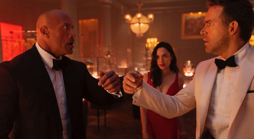
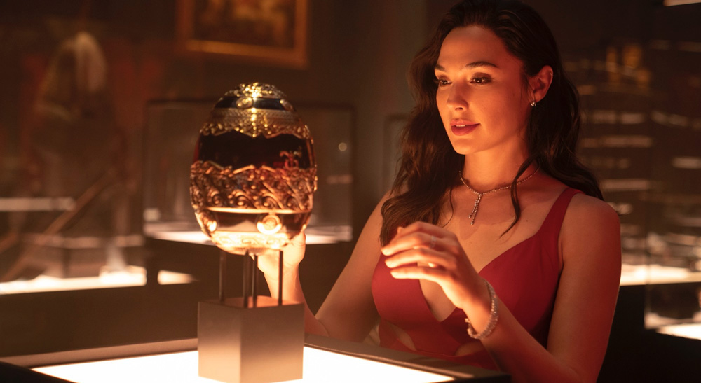
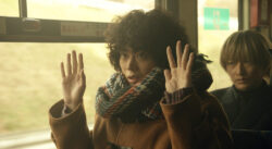
Durante la fase de preproducción, Förderer y el director Rawson Marshall Thurber establecieron una paleta de colores con tonalidades rojas, doradas y cálidas, a fin de complementar los lugares mencionados en el guion. Volpatto define la estética de la película tomando dos escenas como referencia: “Gran parte de la acción ocurre en la sala roja. La sala en sí y el vestido colorado de Gal Gadot tenían que ser de un color bien intenso. Por el contrario, en la prisión en Rusia se necesitaba una estética opuesta, dado que es un lugar frío con una paleta de tonos para nada cálidos. Así que esos son los dos colores principales que se destacan en toda la película”.
Las primeras pruebas de cámara ayudaron a que Volpatto y Förderer crearan una sola conversion table in DaVinci Resolve Studio, la cual permitió modificar las diferentes tonalidades y, al mismo tiempo, representar los tonos de piel de manera natural y sutil: “A los dos nos gusta preparar una estética con anticipación en Resolve, para que Markus pueda trabajar en el set como si tuviese material fílmico personalizado, con la iluminación que concuerda con una sola LUT, en vez de andar con múltiples tablas. Solo tiene que enfocarse en el medidor de luz y la iluminación en sí, y ni siquiera utiliza el monitor”.
“Es más parecido a la dinámica que emplean los cineastas, en la que ya están al tanto de antemano de lo que quieren lograr para una toma en particular, así que luego van y saben exactamente el material que deben captar. Para el etalonaje final, nos sentamos, le damos forma a las escenas y pulimos los detalles. Pero los atributos generales de la imagen se establecen con anticipación, de manera que no hay que reinventar la rueda en la etapa final del etalonaje”, detalla Volpatto.
Efectos especiales adicionales
A pesar de la amplia planificación a la que se sometió Alerta Roja, el estilo de grabación que impuso la pandemia trajo desafíos en todas las etapas: “Algunas escenas se rodaban en exteriores, pero cuando llegó la pandemia, ciertas tomas se captaron en Atlanta, a las cuales agregamos partes de otras grabaciones”, recuerda Volpatto. Como resultado, fue necesario incluir más efectos visuales de lo inicialmente anticipado: “A veces tuvieron que rodar sin extras y luego superponerlos junto con el fondo y los efectos”.
Aunque los efectos visuales requieren de muchas técnicas de composición, Volpatto no tuvo problema a la hora de fusionar elementos, creando “superposiciones perfectas” de los distintos tipos de tomas. “Había algunas imágenes extraordinarias que igualmente necesitaban ciertos ajustes. Se logró mucho en la etapa de efectos visuales, para luego realizar las correcciones cromáticas, aunque utilizaron algunas herramientas con el propósito de refinar la estética cuando diferentes partes de una misma escena se había rodado con meses de diferencia”.
P3 y HDR en DaVinci Resolve
Gracias a DaVinci Resolve Studio, Volpatto tuvo la posibilidad de crear un proyecto en formato P3 y, al mismo tiempo, revisar rápidamente los contenidos en HDR: “La transformación del espacio cromático en Resolve me permitió analizar las imágenes en P3 y HDR simplemente con un par de clics. Por lo tanto, podía etalonar una escena, luego revisar de inmediato en HDR y hacer los recortes necesarios”.
Además, al emplear las herramientas de colaboración, Volpatto pudo trabajar de manera “rápida y eficiente”, incluso cuando seguía recibiendo tomas para efectos visuales: “El editor Chris Doerr y yo trabajamos en el mismo proyecto en Resolve, lo que significó que él podía marcar con suma agilidad cualquier toma que debíamos reemplazar, llevar a cabo dichos cambios y luego ocuparnos de los pequeños efectos visuales necesarios en la etapa de finalización. Él estaba en un escritorio solo con acceso a la versión Rec. 709, mientras que yo podía ver las imágenes al instante en mi sala. Al usar la función de transformación del espacio cromático, podía visualizar inmediatamente los contenidos en Rec. 709, P3 y HDR sin tener que usar una LUT ni nada por el estilo en la estructura nodal. Solo debía ajustar las salidas en la transformación del espacio cromático. Resultó ser muy eficiente. No paramos de trabajar un minuto”.
https://youtu.be/_L0DMAFBEjs
Did you like this article?
Subscribe to our NEWSLETTER and you won't miss anything.
Related articles
 The Mexican series 'Somos Oro' (Amazon Prime), graded with DaVinci Resolve Studio
 The dramatic dystopia 'The Fortress' (Viaplay), graded with DaVinci Resolve Studio
 Spotify's new advertising campaign graded with DaVinci Resolve Studio
 ‘The Walking Dead: Daryl Dixon’, etalonada con DaVinci Resolve Studio
 The new version of the iconic series 'Heartbreak High', on Netflix, graded with DaVinci Resolve Studio
 'Drive My Car', Oscar for Best Foreign Film, graded with DaVinci Resolve Studio
 ‘Don’t Call It Mystery’ (Fuji TV), etalonada con DaVinci Resolve Studio
 The 'Pagan Peak' series (Sky Deutschland) graded with DaVinci Resolve Studio
 'Don't look up' (Netflix), graded with DaVinci Resolve Studio
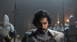 ‘The Green Knight’, etalonada con DaVinci Resolve Studio
 La tercera temporada de ‘Brassic’ (Sky), etalonada con DaVinci Resolve Studio
 'Gaey Wa'r', graded with Blackmagic Design's DaVinci Resolve Studio
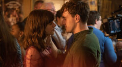 ‘Normal People’, the BBC and Hulu adaptation, graded with DaVinci Resolve Studio
 The ‘Please Tell Me I’m Adopted!’ series, edited and graded with DaVinci Resolve Studio